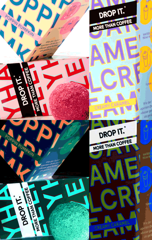
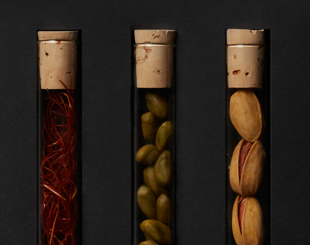
This line of organic convenience products brings a splash of color to otherwise earth-toned vegan shelves. The packaging depicts the ingredients very clearly, showing them in their untouched natural state rather than as processed serving suggestions. The main ingredient takes center stage on the label and is orbited by the other flavorful ingredients. The use of a double-sided Banderole allows for maximum information on minimum space and opens up a view to the product at both sides. The packaging also offers transparency – both literally and in terms of the ingredients and origin of the product.
Vevenga


