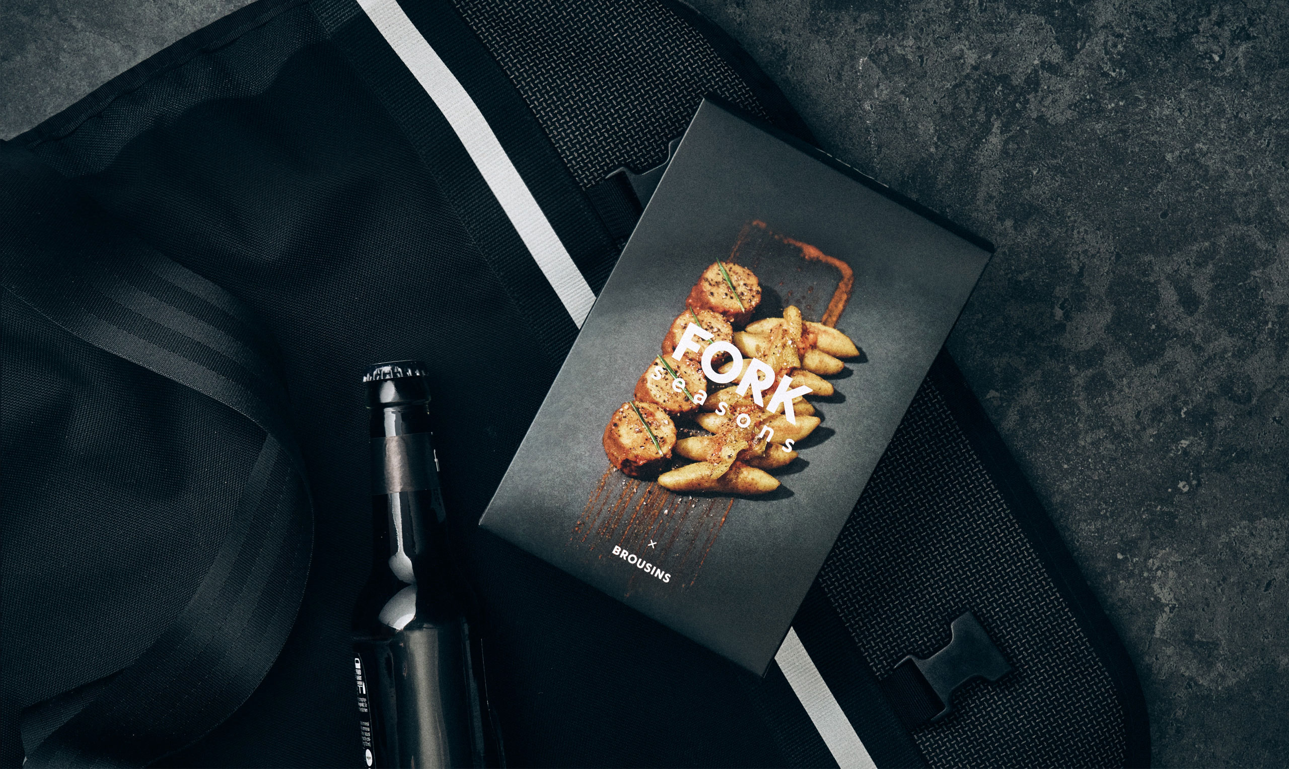
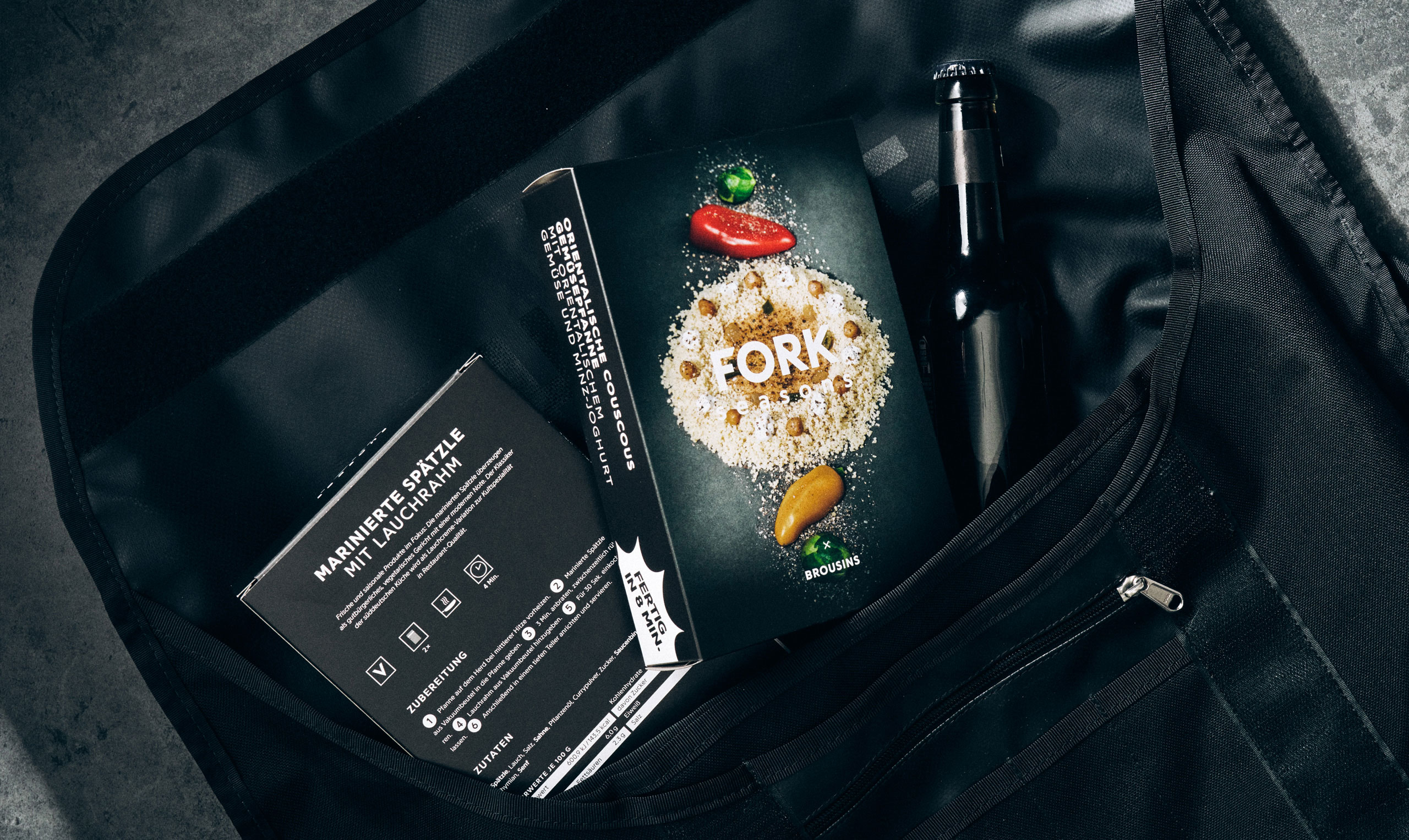
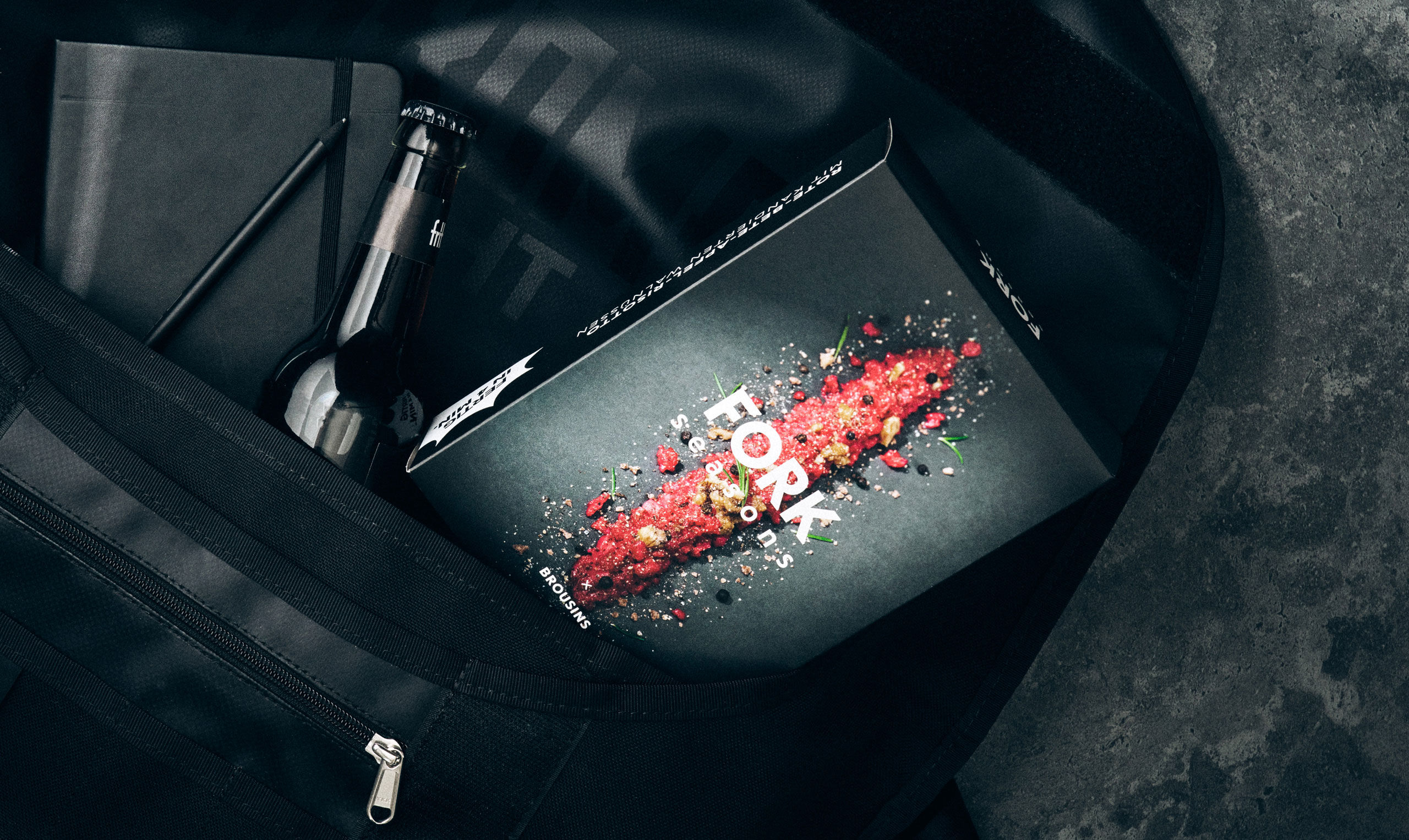
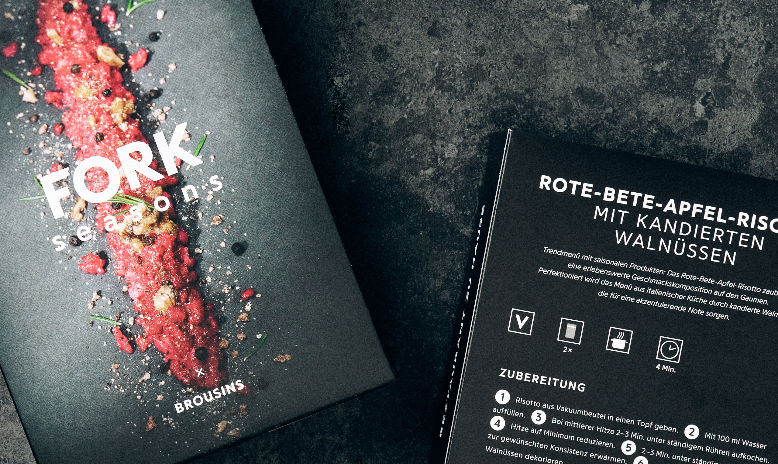
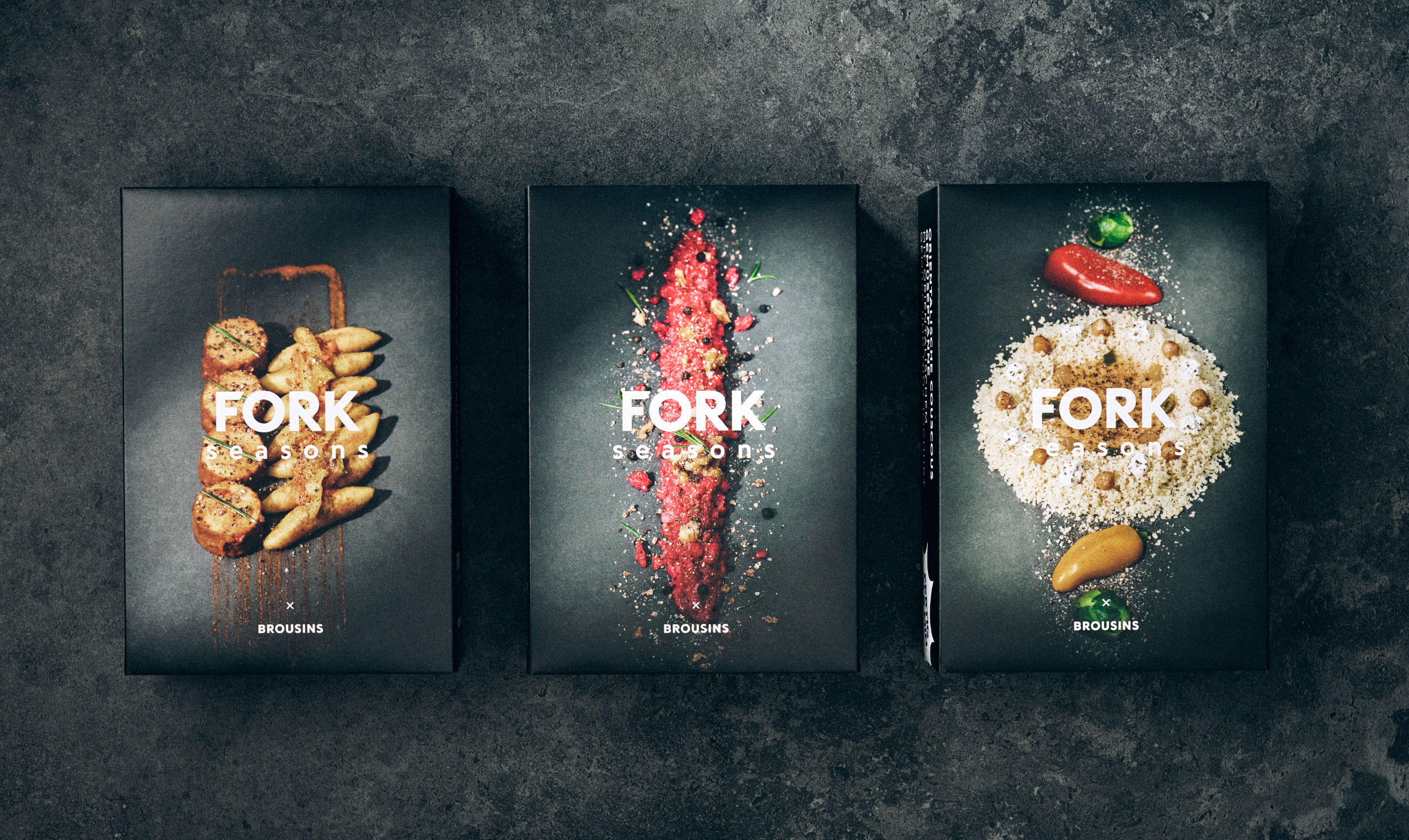
Fork Seasons dishes are prepared using ingredients that are both seasonal and local. The brand is young, bold and is aimed at an urban q-commerce target group. The design deliberately avoids the classic aspects of food communication: The logotype is hard edged, the white typography creates the highest possible contrast to the black background and you won’t find a plate in the food styling.
Further projects
Packaging
-
ChocolainPackaging
-
Coeur de beauté – white linePackaging
-
Coeur de beautéPackaging
-
ZazzaPackaging
-
ShatohPackaging
-
Angels AdvocatPackaging
-
Zeit für BrotPackaging
-
Biopolar – Ice creamPackaging
-
OhdePackaging
-
BrousinsPackaging
-
Biopolar – PizzaPackaging
-
Eau de BerlinPackaging
-
Frucht und FreundePackaging
-
SalamateePackaging
-
Czerr – NaturbäckereiCorporate Design
-
ShatohPackaging
-
Fit – Art editionPackaging
-
Faustmann FeingebäckPackaging
-
Drop ItPackaging
-
OHDE – LiqueurPackaging